INTRODUCTION
Show Me The Honey!
“A Sweet UX Success Story”
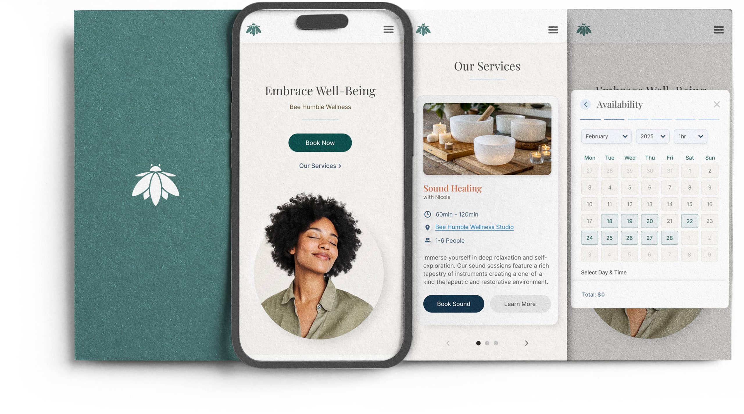
Bee Humble Wellness is buzzin’! In the first quarter, the new streamlined booking system, paired with a beautiful visual overhaul, not only boosted revenue by a delightful 44% but also welcomed twice as many excited new customers to the hive!
Sparking a UX Transformation
The client, a vibrant local wellness studio owner with a passion for helping people find their zen, had a bit of a booking bottleneck. Their system for scheduling appointments and events was, shall we say, a little old-school, think phone calls and email chains. While their clients loved the personal touch once they actually got booked, the process itself was about as relaxing as a rush-hour traffic jam. This meant potential clients were struggling to easily browse services, see what was available, and book on their own time, leading to missed opportunities and a lot of back-and-forth for the studio staff. In short, their booking process was less “ohm” and more “ugh,” hindering their ability to grow and share their wellness magic with more people.
Cultivating a Digital Sanctuary
By creating a vibrant online space, I aim to help Bee Humble Wellness blossom, reaching more customers seeking their individual path to well-being. This digital sanctuary will not only simplify the flow of energy within the studio’s operations but also create fertile ground for welcoming new seekers into the Bee Humble community. I’ll be monitoring the rhythm of new bookings and the acquisition of new faces joining the studio in the months following the launch, ensuring the digital efforts are helping their wellness garden grow.
My Journey with Bee Humble
So, where did I fit into this quest for booking bliss? Well, as the solo UX and Design adventurer on this 12-week journey, I wasn’t just tasked with untangling that old-school booking system. Oh no! This was a full-on transformation. I dove headfirst into not only reimagining and designing a a refreshingly simple booking experience and website, but was also tasked with giving the entire Bee Humble Wellness brand a fresh, vibrant makeover. Think of it as a complete wellness retreat for their online presence, from the initial user flow to the final visual flourish, and even the very essence of how Bee Humble presented itself to the world. It was a whirlwind of user research, information architecture, wireframing, prototyping, testing, visual explorations, and a whole lot of coffee, all aimed at making their digital door as welcoming and easy to navigate as their studio’s serene atmosphere.
EMPATHIZE
Resourceful Research
“Unearthing Insights on a Budget”
Despite a limited budget, generative research yielded valuable insights through three key methods. I started with what I called “The Zen Immersion”, observing users directly during their booking journey. Next, “The Competitive Alignment” involved a mindful analysis of competitors. Finally, I implemented “Tapping the Source“, surveying the existing Bee Humble customer base with an incentive for their feedback. These cost-effective approaches provided crucial understanding of user needs.
Research Objectives
“Finding Our Flow”
Contextual Inquiry & Observation
“The Zen Immersion”
You can’t design a peaceful experience without truly feeling the user’s friction. So I spent time in the studio, literally, observing how staff currently handle booking inquiries. I also (with permission!) observed clients trying to book via phone and email, noting hesitations and frustrations from both users and staff.

Analyzing the Competition
“The Competitive Alignment”
A thorough Competitor Analysis was performed, focusing on wellness studios (local and beyond) that have thriving online booking systems. I analyzed their user flows, features, design, and overall booking experience.
By seeing what’s working well in the “wellness ecosystem,” I was able to identify best practices, potential innovative features, and even areas where Bee Humble can differentiate themselves. It was about aligning their digital “chakras” with successful models while still maintaining their unique essence.
Understanding the User’s Process
“Tapping the Source”
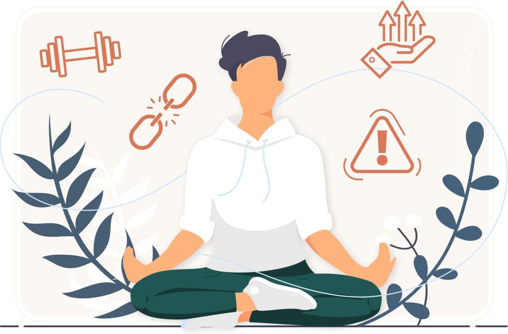
Initial generative research aimed to cultivate a deep understanding of current booking habits, both in the digital sanctuary and through more traditional paths like phone calls and emails. Through a thoughtfully crafted user survey, I harvested invaluable insights into booking behaviors, preferences, and pain points using Bee Humble’s current customer base. As a token of our gratitude for their time and wisdom, we offered a little extra dose of tranquility, an incentive on their next visit to the hive, in exchange for their participation. This initial exploration allowed nurturing a more seamless and intuitive booking experience, ensuring every interaction with Bee Humble felt as restorative as the services they offer, laying the groundwork for a truly harmonious and intuitive booking experience down the line.
This also served as a great time to get user demographics!
When I was already asking our users about their booking experiences, it just made sense to gently weave in relevant questions about who they are. It was an efficient way to gather a more complete picture, not just what they’re doing, but who is doing it! This helped understand the different “wellness tribes” and their unique needs, all while keeping things streamlined and avoiding asking for too much information at different times. It was like a mindful approach to data gathering, ensuring a rich, well-rounded understanding without overwhelming users.
Market Trends in Booking
“Unveiling the Landscape”
Just like finding the perfect balance in your wellness routine, nailing the booking process is key for Bee Humble. I’ve taken a holistic look at the online booking landscape, the growing trends, what users are craving, the potential imbalances, and the healthy habits of successful platforms. This secondary research is my way of cultivating the insights needed to create a booking experience for Bee Humble that feels intuitive and supportive.
Wellness Booking Empathy Map
“The Emotional Journey”
Let’s dive into the hearts and minds of our wonderful users. Before I could truly craft a blissful booking experience for our wellness website, I needed to understand the whispers of their souls, the stretches of their desires, and the occasional omg, is this really happening? moments. So, I created an empathy map, a pathway into their inner zen gardens. Exploring what users really think, feel, say, and do on their journey to a healthier, happier self.
DEFINE
Synthesizing clarity
“The Diagnosis”
This stage of the project truly acted as a holistic health check-up for user experience. I’ve just completed the “diagnosis” from the research, and now synthesizing that data to pinpoint the core “ailments” users face when trying to prioritize their well-being.
What Our Research Revealed
“Hive Mind Insights”
Based on my initial exploration into the Bee Humble booking journey, several key insights blossomed, directly addressing our research objectives:
First off, the current booking flow? Definitely a bit of a barrier to a smooth user experience. Observing staff and clients revealed a time-consuming, multi-step process involving phone calls, emails, and manual data entry, creating frustration for both parties and hindering efficient booking.
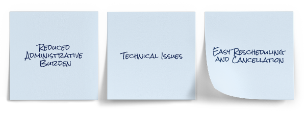
Secondly, it’s crystal clear that convenience and accessibility are paramount for users booking appointments. The overwhelming preference for online booking expressed in the survey shouts that they want that 24/7 access and the freedom to browse and book on their own time, just like they do with other booking platforms. This highlights the need to integrate seamlessly with users’ digital lifestyles.
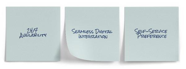
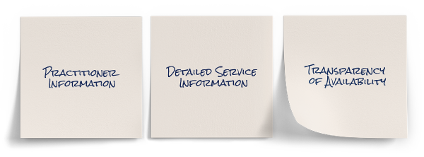
Thirdly, users crave transparency, control and a and a booking experience that feels like it was designed with them in mind. Think clear pricing, easy-to-find info on services and practitioners, the power to choose their perfect time slot, and simple ways to manage their own appointments. Our peek at what other successful wellness spots are doing just confirms that a positive and informative online space is key to happy users.
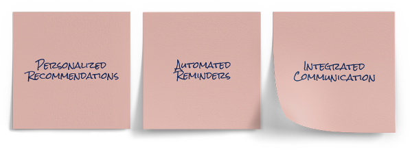
Lastly, users are definitely into the techy side of booking. They’d love things to play nicely with their phones, sync with their calendars, and even get personalized suggestions, hinting at a chance for Bee Humble to create a more tailored and connected experience that keeps them buzzing back for more.
Other important challenges I discovered based on market research include data security and privacy, trust and verification, lack of personal interaction.

Basically, even with budget-conscious research, I was able to reveal a strong user desire for a modern, online booking system that prioritizes convenience, clarity, control, and seamless digital integration. Moving away from the manual hustle presented a significant opportunity for Bee Humble to cultivate a more “zen” and efficient experience for both their clients and staff, ultimately supporting their growth and mission.
User Persona
“The Wellness Seeker”
Scenario: Mia’s been feeling pretty overwhelmed lately. Her job demands long hours, and she often ends up working late, which messes with her sleep. She’s heard good things about the calming effects of Sound Baths and Reiki for balancing energy, mostly through wellness podcasts and social media. One night after a late shift, while scrolling through Instagram, a post for a local studio offering Sound Baths caught her eye. Intrigued, she clicked over to their website, hoping it’d be super quick and easy to book a session for the weekend. What she really wants is to just browse available times and snag her spot instantly on her phone or laptop, instead of having to call during work hours.
Booking Journey Map
“Mapping The Digital Hive”
Instead of charting the flight path of Bee Humble’s current old-school communication (phone calls and emails), I looked at how other thriving wellness hives have built their online systems for booking. Mapping the digital journeys of competitors who’ve already embraced online scheduling will gave us the real sweet insights. It showed exactly how users expect to navigate, what makes them happy, and where the potential sticky spots might be in the online world. It’s like getting the blueprint for a thriving digital garden, rather than just analyzing why the current phone-and-email patch isn’t blooming as much as it could. I want to build a buzzing online experience, not just put the old way on a computer!
The Problem Statement
“A Case For Change”
Users need an intuitive, self-service online booking system because the current multi-step process involving calls and emails is time-consuming and inconvenient, leading to frustration for both clients and staff, and ultimately hindering the company’s ability to efficiently serve clients who expect 24/7 digital accessibility.
IDEATE
From Insights To Ideas
“Breathing Life Into Bee Humble”
In the Ideation phase, my focus shifted from understanding user needs to cultivating solutions that would genuinely enhance the user booking experience. This wasn’t just about brainstorming features; it was about nurturing ideas that would alleviate pain points and elevate the user’s journey to well-being.
Goal Alignment
“Finding Our Center”
Now that the research has unveiled a deeper understanding of what users truly need, it was time to mindfully weave those insights into the fabric of the business goals. This alignment wasn’t just a bonus; it’s the very foundation for long-term vitality. When we ensure our solutions directly nurture our users’ well-being by easing their frustrations and fulfilling their desires, we naturally cultivate their satisfaction, loyalty, and even their enthusiastic support – all of which organically fuels business growth through deeper engagement, more conversions, and positive connections.
On the other hand, overlooking what users truly seek, even with the most innovative features, risks creating a disconnect, leading to user frustration and ultimately hindering Bee Humble’s ability to flourish. This thoughtful alignment phase allowed transformation from creative explorations into initiatives that are not only nourishing for users but also yield meaningful and sustainable value for Bee Humble’s business, creating a healthy ecosystem where everyone thrives.
Revisiting HMW Framework
“Blooming Possibilities”
Having cultivated a deep understanding of users’ needs through research, it felt like the right time to nurture the seeds of my “How Might We” questions. These thoughtfully crafted questions were the fertile ground for my initial ideas. By tending to each HMW statement once more, I can use them as guiding lights to cultivate a rich harvest of potential solutions. Each question illuminated a specific pathway, encouraged to think expansively and explore diverse ways to nourish the core challenges users face. This focused approach ensured brainstorming sessions were intentional and ultimately yielded more relevant and innovative solutions.
HMW Brainstorming:
Select a drop-down to see proposed ideas.
A SCAMPER Session
“From Friction To Flow”
The SCAMPER method proved to be a logical and effective tool for brainstorming Bee Humble’s booking system design. It got right at what folks are looking for when they’re trying to take care of themselves. Just like a good wellness routine looks at the whole picture, SCAMPER’s way of prompting me to think differently helped see the booking process in a fresh way. Instead of just making something that works, it nudged me to create an experience that feels easy, clear, and like it was made with the user in mind, which is exactly what people want when they’re focusing on their well-being. It helped go beyond just the basics and build a booking system that feels good to use.
SCAMPER:
Select a drop-down to see proposed ideas.
MVP Roadmap
“Building the Hive”
Embarking on my journey to create a thriving booking experience, I begin with the principle of Minimum Viable Product (MVP). Like planting the first seeds in a garden, my initial focus was to cultivate the most essential features with a user-centered approach. This allowed me to quickly offer core value, gather vital feedback from early adopters, and mindfully nurture the platform’s growth, ensuring each subsequent feature blossoms in direct response to user needs and fosters a truly harmonious booking journey.
Effort: Low
Necessity: Must Have
Effort: Medium
Necessity: Must Have
Effort: High
Necessity: Must Have
Effort: High
Necessity: Must Have
Effort: High
Necessity: Must Have
The User Flow
“Harmonious Steps”
To ensure a harmonious and effective online booking experience, I’ve crafted a user flow map based on the foundational MVP roadmap. This visual journey charts the essential steps a client takes, from discovering offerings to confirming their appointment, focusing on clarity and ease. By mapping this core experience, I aimed to cultivate a smooth and stress-free path, allowing users to effortlessly connect with the wellness services they seek, mirroring the focused and intentional approach of the initial product launch.
Initial Site Map
“The Root of Resonance”
Rooted in foundational MVP roadmap, Bee Humble’s initial website sitemap will mindfully focus on the essential spaces visitors need to discover offerings, feel their resonance, and seamlessly book their wellness journey. This streamlined structure prioritizes the core paths highlighted in our MVP, ensuring a clear and direct flow for those early explorers. Think of this sitemap as the first breath in a deeper practice, a vital starting point that will naturally expand and evolve as I gather feedback and refine their online sanctuary. Just as a wellness journey unfolds with intention, the website will grow organically, accommodating new content, features, and optimized pathways to better serve the community.
Wireframes
“Balanced Blueprints”
To ensure Bee Humble offers a truly serene experience, I started with low-fidelity wireframes as part of the Minimum Viable Product approach. This let me calmly map out the fundamental user journey and essential screen layouts, keeping things simple and free from visual clutter at this early stage. By honing in on the “minimum viable” elements of the booking form, from selecting a service to confirming payment, I rapidly improved the site’s flow and ease of use. After testing core assumptions about how users will interact, I made multiple iterations ensuring a smooth, stress-free path for users, while gathering valuable feedback before fully immersing myself in detailed design and development
Home Page
Booking Form
PROTOTYPING
Bringing Ideas to Life
“Harmonizing Interactions”
Prototyping kicked off by digging into all the rich insights gathered, much like planting the most vital seeds for a thriving garden, every decision was rooted in the data collected. Staying true to the Minimum Viable Product (MVP) approach, initial mid-fidelity prototypes allowed a quick check of the “health” of foundational concepts, ensuring design choices truly blossomed from real user needs and behaviors. After soaking up valuable feedback from testing those initial mid-fidelity prototypes with Bee Humble’s current users, I crafted our high-fidelity prototypes. This phase transformed validated concepts and user-driven improvements into a polished, visually refined, and interactive experience, representing a near-final version of the user interface that’s all ready for another round of testing, validation, and iteration!
High-Fidelity Prototypes
“The Seamless Path”
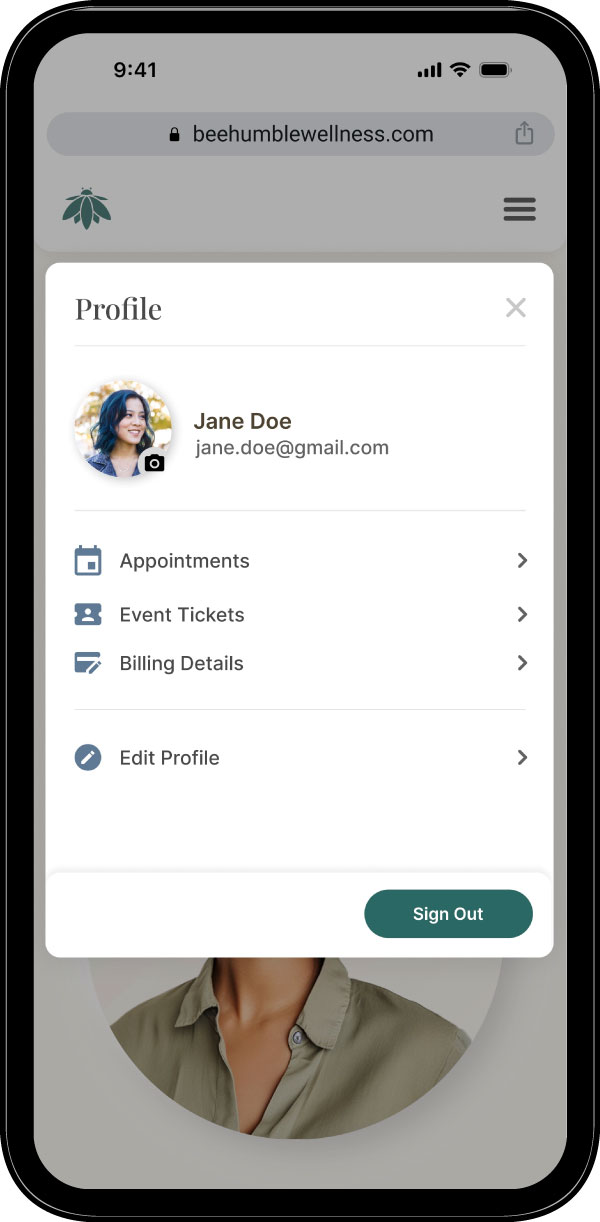
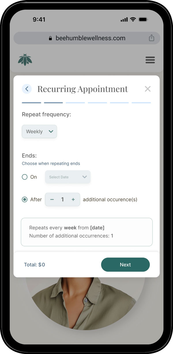
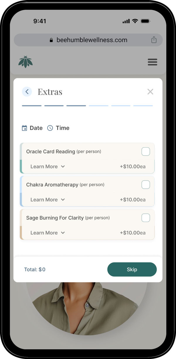
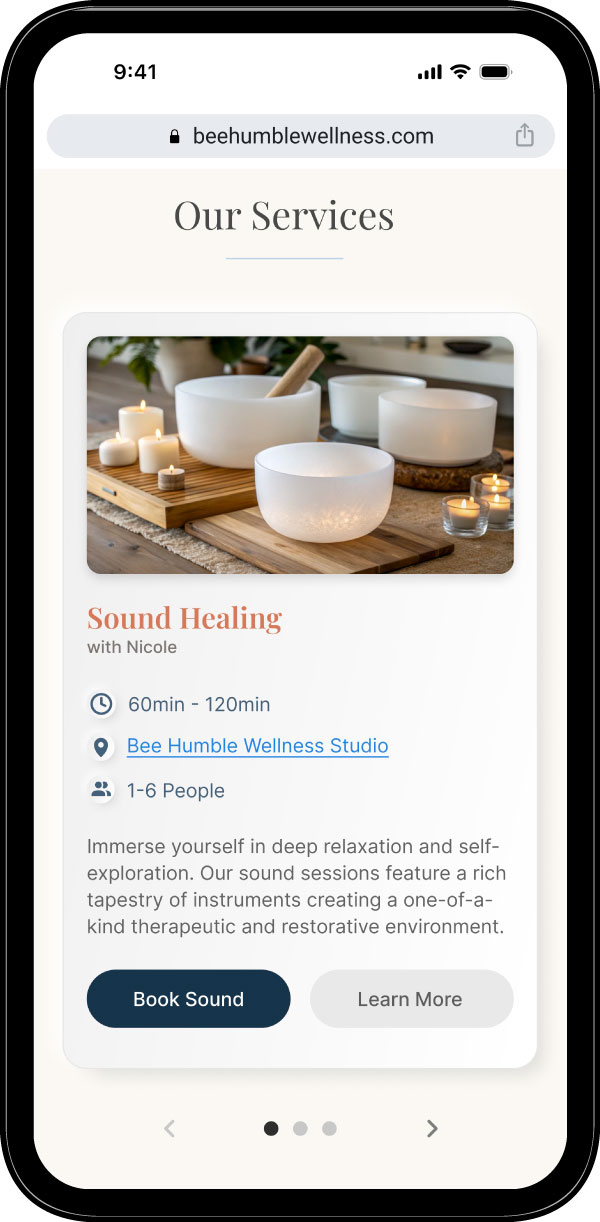
To ensure a seamless user experience, I designed the website with a calming, minimalist aesthetic that aligns with the therapeutic nature of the services. My goal was to streamline the user journey from discovery to booking, guiding users intuitively while fostering a sense of trust and clarity.
This design philosophy was extended to the booking form, where I aimed to create an experience as calm and effortless as the wellness services themselves. Instead of a long, overwhelming form, I used a multi-step approach with clear progress indicators to prevent cognitive overload. By scrutinizing every field and only asking for essential information, I transformed a potentially frustrating task into a reassuring and simple preliminary step on the user’s path to well-being.

USABILITY TESTING & ITERATION
Refining the Experience
“Evaluate & Evolve”
With high-fidelity prototypes in hand, it was time for the moment of truth: usability testing! This was my opportunity to invite real users to explore the design, validating successful elements and identifying areas for improvement. My mission? To make sure Bee Humble’s website felt as harmonious and supportive as their offerings, ensuring every click resonated with that signature balanced vibe.
Usability Test
“Assessing Pathways”
During this moderated remote usability study I aimed to gather invaluable qualitative feedback in the booking website’s core functionalities, validating assumptions and uncovering unexpected user needs. By understanding how real users interact with the platform, I aimed to identify pain points and opportunities for improvement. Each participant was given a series of realistic scenarios to complete using the Figma prototype, designed to cover critical user flows.
Key Findings
“Clicks to Clarity”
Through comprehensive usability testing sessions, I observed a range of user behaviors and gathered valuable insights. Several recurring patterns consistently emerged across participants, clearly highlighting specific areas where the overall user experience could be significantly improved. These findings were critical in guiding future design iterations to ensure the Bee Humble platform is not only functional but also intuitive, efficient, and truly supports a serene user journey. My observations pointed to both friction points and unmet needs, providing a clear roadmap for enhancing Bee Humble’s key features and interactions.
Iteration
“Refining the Experience”
The critical findings provided a clear, evidence-based roadmap, highlighting specific areas where the overall user experience could be significantly improved. My observations pointed directly to both immediate pain points and deeper, unmet user needs, which were essential in guiding the next phase of the design process.
The subsequent design iterations detailed below were directly informed by these insights, ensuring the Bee Humble platform evolved to be not only functional but also more intuitive, efficient, and truly supportive of a serene and focused user journey.
ACHIEVEMENTS
Exceeding Expectations
“Validating Success”
This moves beyond the “how” of the process and focuses on the tangible, data-driven impact of the Bee Humble platform’s design. Following the successful deployment of our final, user-validated iterations, I tracked the project’s success against initial goals.
The Results
“Measuring Impact”
These quarterly results provide a clear validation of our user-centric approach, demonstrating a significant and measurable uplift in core product metrics. This data proves that by solving critical user friction points, my design changes directly led to improved usability, higher user retention, and the achievement of the platform’s critical business objectives. The following metrics quantify the success of the Bee Humble project.
LESSONS LEARNED
Unexpected Outcome
“Beyond Usability”
Designing for Bee Humble Wellness required a digital environment that mirrors the physical one, calm, supportive, and clear. By removing the administrative stress of booking, I ensured that the user’s relaxation begins the moment they visit the website, not just when they step into the studio. But, something unexpected emerged.

The Downside of Frictionless Design…
One of my core goals for the customer portal was to empower users with absolute autonomy, allowing them to manage appointments with zero friction. However, post-launch data revealed an unexpected metric: an abnormal spike in cancellations.
What Went Wrong?
“The Paradox of Control”
Standard UX best practices usually dictate that we should remove barriers and make interactions as seamless as possible. In this project, I applied that logic to the cancellation flow, giving users full control to cancel with a single click.
This hyper-efficiency led to a significant churn rate in confirmed bookings. I discovered that for high-intent, high-anxiety services like wellness and therapy, efficiency is not always the primary metric of success.
“I had learned that UX isn’t just about usability; it’s about behavioral design.”
Wellness appointments can trigger the “Cold Feet” Phenomenon, a psychological response characterized by the status quo bias (the preference for things to stay the same). When a user feels nervous about a new treatment or session, a zero-friction cancellation process can become an escape hatch for their anxiety.
When we make it too easy to cancel, we can inadvertently support the user’s anxiety rather than their ambition.
In moments of doubt, users may often talk themselves out of self-improvement commitments. By removing all friction, I had removed the “guardrail” that helps users stick to their goals.
Future Application
“Positive Friction”
To address the high cancellation rate without removing user autonomy, I pivoted the design strategy from “Maximum Efficiency” to “Supported Commitment.”
Implementing “Positive Friction”
The goal was not to trap the user (a “dark pattern”), but to introduce a moment of reflection, a “speed bump”, that interrupts the impulse to quit and offers a supportive alternative.
